Right now, data visualization is a hot topic! It’s a great tool for presenting long sets of data in a way that’s efficient and easy to understand. Data visualization isn’t a new concept, but through innovation and new technology there are now more ways to view, understand and remember high levels of information.
We’re partial to performance snapshots as an effective tool for data visualization. They’re succinct when sharing information, visually appealing, and allow the user to interact with the data, which ultimately increases their understanding of it. But we’ve come across other noteworthy data visualizations as well.
Nowadays, the traditional bar chart or pie graph is a thing of the past. Even mind maps, concept maps and other traditional graphs or mapping systems are just the tip of the iceberg. Data visualizations are now elegant and extraordinary, so much so that you may be inclined to hang them as art once you’re done analyzing the data.
Unique Data Visualizations
Infoesthetics.com from Andrew Vande Moere is an interesting blog that collects unique and inspiring data visualizations. Here’s a visualization he shared August 2012 from a Russian data visualization team that illustrates the vastness of the internet, with each circle representing a specific website. Learn more on this visual here.
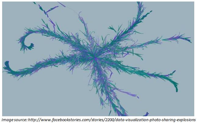
Another visual that caused a recent buzz was the “photo-sharing explosions” from the creators at Facebook. These short videos traced the life of a single piece of content shared throughout the Facebook community. The effect is truly dazzling. View the videos here and check out the Stamen Design blog to find out how they were created.
Of course, we can’t forget infographics. Immensely popular, infographics can be made about anything from the composition of an organizations customer base, to the effects of too much sugar on the human body. They’re fun, colourful, and a great way to collect information and display stats and stories. We recommend dailyinfographic.com as a fun website if you’re interested in browsing designs.
How Do Performance Snapshots Stand Out?
So, what’s the difference between performance snapshots and other types of data visualizations? Well there’s many. Other data visualizations often speak to a single, specific topic, and once they’re created, they aren’t easily updated. Snapshots have the capability to be updated on an ongoing basis with minimal effort. This is what makes them an exceptional management tool and not just for one-time use.
Snapshots are also one of the few data visualizations that allow for interaction with the data, which is useful when using it as a communication tool. You can also enjoy the flexibility to design your snapshot exactly the way you want it. Whether that means stronger visuals or heavier emphasis on writing, it’s up to you.
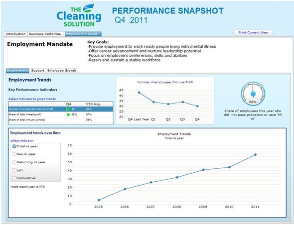
Check out this recently-created snapshot from The Cleaning Solution, or play around with the interactive version in our gallery of performance snapshots.
But remember: whatever form of data visualization you’re creating – whether it’s a snapshot, infographic or even a basic pie chart, the most important thing to keep in mind is the balance between form and function. Your data visualization shouldn’t be boring, but it must be powerful and convey information quickly and efficiently. Otherwise, you lose the intention and ultimately your audience.
All About Data Visualizations
blog type:
Issues & Ideas
