
Sharing thoughts from The Chronicle of Philanthropy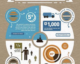 In Visualizing Data Helps Charities Get Attention, a recent article published in The Chronicle of Philanthropy, Nicole Wallace paints a compelling picture of the value of infographics and data visualization in communicating a cause and spurring awareness. While the article focuses on charities, the messages and key points are applicable across organizational structures; social enterprises, mission-based businesses, co-operatives, and charities alike could all benefit from Wallace’s insights.
Wallace profiles a handful of charitable organizations and their use of infographics (a combination of important facts, stories, and images) and highlights how this form of communication can be a great education and awareness building tool. We are excited to see that Wallace also discusses how good visualization helps an organization understand its own data and, with this understanding, improve programs and operations. In other words, infographics and data visualization can be excellent management tools.
How does this apply to Demonstrating Value? When groups use the Demonstrating Value framework to create a snapshot for their organization, we encourage them to view this as a communication tool. We place great emphasis on the value of using this snapshot as a management tool for operations within the organization.
“Humans are incredibly visual creatures”
A fundamental message in Wallace’s article is that you need to spend time thinking about your audience when developing data visualization. Whether your audience is a funder, donor, staff, or Board, you need to determine what messages will resonate with them, what information is useful for their purposes, and what will motivate them. It all comes down to engaging your audience, to inspire interest, support, donations or funding. For example, we have seen how snapshots developed by social enterprises with the Demonstrating Value framework have been tailored to the targeted audience by carefully selecting narrative and images that are meaningful and applicable to the viewers.
Simple and Clear
A common roadblock in the development of data visualization tools for communication and management purposes is the tendency to include too much information. It is easy to get caught in the sea of data that can be found in an organization. To ensure that messages are clear and concise, a small selection of indicators is all you need. Ask the question “What do I need to know to make decisions effectively?”. If you select your indicators based on this question and accept that you cannot – and should not – show everything, your organization will have much more success creating visualization tools that convey your message to the community and provide management with key data for decision-making. This is exactly the message that Demonstrating Value shares with social enterprises who are developing a snapshot – what do you really need to know and show?
Collaborative Visualization
The concept of multi-stakeholder buy-in and collaboration is at the forefront of effective data visualization. For example, the article suggests that “[o]ne way for a charity to get started…would be to put the designer who lays out the annual report, the person who heads research or data collection, and the person in charge of the organization’s Web site together in a room for a couple of days”. Similarly, we have noticed that groups who engage various parts of their organization in designing and using a Demonstrating Value snapshot – from front line staff, to managers, to Board members – are able to create a much more comprehensive and useful communication and management tool. In short, a data visualization tool will be most effective if it speaks across the organization and is useful on many levels.
Creating an Infographic: Tips for Nonprofits
(from Visualizing Data Helps Charities Get Attention, published in The Chronicle of Philanthropy)
- Look at a wide variety of infographics, from nonprofits, businesses, and other sources, to get ideas.
- Decide what the charity wants the infographic to achieve. Don’t create one just because it’s a trendy approach.
- Identify what data the organization has collected, but also look for outside sources, such as Census figures, that could bolster the message or help put the group’s data in context.
- Follow the organization’s style guidelines on fonts, color schemes, and tone to maintain the group’s brand.
- Keep it simple. Convey the message quickly and clearly. Too many numbers or ideas can confuse or overwhelm viewers.
- Balance esthetics and substance. An infographic needs to be useful as well as visually appealing.
- Credit sources of data.
- Experiment. Try free and low-cost software to see what’s possible.
Resources & Tools
The Chronicle of Philanthropy article refers to a useful selection of tools and resources for data visualization and infographics, including the following:
- Data Without Borders
- Center for Digital Information
- Google Fusion Tables
- IBM Many Eyes
- Usable Knowledge blog
- Visualizing.org
- 22 Free Tools for Data Visualization and Analysis
At a recent learning event co-hosted by Demonstrating Value and SAP, Steve Williams (SAP) shared some great examples in his discussion of how SAP helps organizations evaluate and communicate impact. Some of these examples and resources include:
- SAP Crystal Solutions – SAP Crystal Solutions provide tools to explore, view, report, visualize and manage information. Visit the SAP website and SAP Community site to see collections of dashboard templates and examples that using Crystal Presentation Design. Canadian Registered Charities can receive SAP software and solutions through the SAP Donations Program, available via TechSoup Canada.
- visual.ly – This site hosts a comprehensive assortment of data visualization templates gathered from the web for you to reference, customize and share.
- Benchmarkers – Specializing in building dashboards using the SAP Business Objects suite of software, Benchmarkers features a showcase of some very impressive dashboards on its website.
- Work/Life Balance Dashboard – SAP has developed a great tool for visualizing what your work/life balance really looks like. Check it out!
- Say It With Charts – This book by Gene Zelazny includes an assortment of techniques for communicating information quickly and clearly, including tips for creating dramatic e-visuals.
- The Back of the Napkin – In this book, author Dan Roam explores the idea of using pictures to solve problems and work through complex business ideas.
- Endeavor Global – SAP helped this global non-profit create a dashboard to demonstrate the organization’s impact across the world.
- 7 Billion Actions – This UN campaign serves as a great example of how to make data meaningful, primarily through their work of gathering population data and creating interactive dashboards for people to engage with.
Image Source: The Chronicle of Philanthropy, Mar 14, 2012 (www.philanthropy.com)